+copy.jpg)
Wednesday, 27 February 2013

Monday, 25 February 2013


Saturday, 23 February 2013
Final design of Masthead

I decided to go for this design of my masthead as my final as I felt it best suited the genre. Typically Indie magazines tend to use formal and capital letters for their mastheads and I wanted to stick to this convention, so that it was obvious of the genre of my magazine. I felt like the colour black would give higher definition to my masthead and stand out as a contrast to the background of my magazine.
I then decided to place the symbols of which I had found and felt reprented 'Indie' as my logo underneath my masthead as I believed it would give the masthead uniqueness, and stand out from other music magazines. With this I wanted my magazine to stand out and be recognisable, and I now feel that when looking at the final result I have managed to be successeful in doing so.
Friday, 22 February 2013
First design of masthead

This is my first design of my masthead/logo. With this I decided to take a less formal approach with the font used for my masthead as the typography I will use for my front cover will be formal, this seems to be a common trait within typical and most 'Indie' magazines. I decided to call my masthead 'The Tape' as when I had asked my target audience in my questionnaire it seemed to be what they preferred, they all agreed that this was the name that best suited the genre I was going for. 'Tape' also connotes music, this is of course what I am aiming for as I would like my magazine to stand out as an 'Indie' music magazine. I decided to place my logo underneath my masthead as I wanted my masthead combined with my logo to be one logo of its own. I felt that this showed uniqueness as when doing my research not many music magazines seemed to have such a logo as this, also the symbols below link to the genre of 'Indie'.
Images and target audience


These are some of the responses I received from my target audience:
"The photo's look unique, and quirky"
"Very out there"
 "Simple but unique"
"Very different"
"Love the use of contrast on the full image"
"The positioning of the person in the image reflects Indie style"

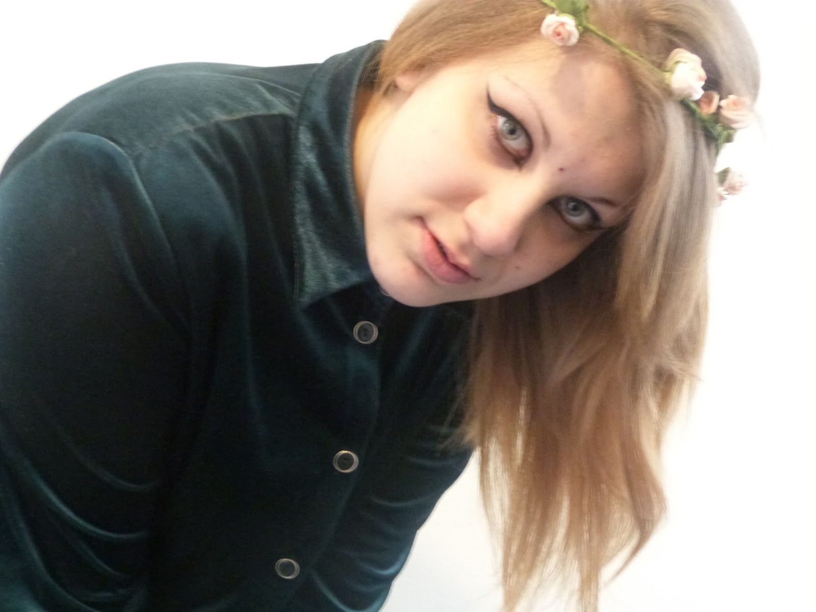
With these responses I was able to apply the best images of which I and my target audience thought best represented the genre of 'Indie'. Overall, I am glad that I had shown my images to my target audience as this ensured that I was making the best decisions for my magazine.
Subscribe to:
Posts (Atom)